Fusedash vs StatPecker
Side-by-side comparison to help you choose the right product.
Fusedash turns raw data into clear dashboards so your team can act on insights instantly.
Last updated: March 4, 2026

StatPecker
StatPecker delivers fast AI-driven insights and stunning visuals from your data for effective business storytelling.
Last updated: March 1, 2026
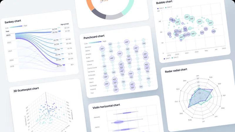
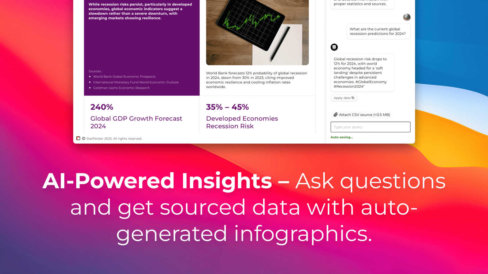
Visual Comparison
Fusedash
StatPecker
Feature Comparison
Fusedash
Unified AI Visualization Workspace
Fusedash consolidates multiple data presentation needs into one platform. Instead of juggling separate tools for dashboards, charts, maps, and reports, teams can build all these views from a single connected dataset. This unified approach eliminates redundant work, ensures metric consistency, and allows you to switch between an interactive dashboard for real-time monitoring and a narrative report for stakeholder updates without duplicating effort or logic.
AI Chart Generator
This feature accelerates the initial step of data exploration and reporting. Users can upload a CSV or connect an API, and Fusedash's AI will quickly suggest and generate the most appropriate charts to visualize the dataset. It helps in picking the right chart type, applying comparisons, and refining labels to accurately tell the data's story. These charts can be used as standalone visuals or seamlessly dropped into larger dashboards and reports.
Smart Data Chat
Designed to make data exploration intuitive, the Smart Chat feature allows users to ask questions about their data in plain language. You can query for specific metrics, request breakdowns by segment or region, and get AI-suggested visualizations. The insights generated through this conversational interface can then be instantly turned into shareable, persistent views within a dashboard, making advanced analysis accessible to everyone.
Flexible, Audience-Specific Views
Fusedash understands that different teams need different lenses on the same data. This feature allows you to customize how data is presented for each audience. From a high-level executive dashboard to a detailed operational map or a marketing report with storytelling context, you can build the right view by customizing layouts, filters, and time ranges—all while reusing the same underlying data definitions to maintain absolute consistency.
StatPecker
Ask Your Query
This feature allows users to gain instant insights from validated sources simply by asking questions. There is no need for complex tools or extensive data manipulation; users can easily request information and receive immediate, accurate responses.
Publish & Embed
With this feature, users can create interactive visuals that are seamlessly integrated into various platforms such as blogs, articles, and websites. This capability enhances the user’s ability to communicate data-driven insights effectively and attractively.
Upload & Analyze CSVs
StatPecker enables users to upload local CSV files, facilitating the extraction of key insights without the hassle of traditional spreadsheet software. This feature allows data analysis to be performed quickly and efficiently, streamlining the process of data visualization.
Download & Use Anywhere
Users can export their created infographics as images, making them easy to include in reports, presentations, and other formats. This flexibility ensures that users can utilize their visuals wherever needed, enhancing the overall impact of their data storytelling.
Use Cases
Fusedash
Streamlining Executive Reporting
Leadership teams need a consistent, high-level view of company KPIs without getting bogged down in data discrepancies. Fusedash solves this by allowing executives to access a single dashboard that combines real-time metrics with narrative storytelling sections. This provides clear context on what changed, why it matters, and what the next steps are, replacing fragmented slide decks and ensuring all leaders are aligned on a single source of truth.
Empowering Marketing Performance Analysis
Marketing teams can connect multiple data sources (e.g., ad platforms, web analytics, CRM) into Fusedash. They can define core campaign metrics once and then build various views: real-time dashboards for daily monitoring, AI-generated charts for performance deep-dives, and segmented reports for channel-specific analysis. This eliminates manual data stitching and allows marketers to quickly identify trends and optimize spend.
Operational and Geographic Monitoring
For operations, logistics, or sales teams managing field activities, Fusedash's mapping capabilities are crucial. They can visualize performance or incident data geographically on detailed maps. By combining this with dashboard filters and drill-downs, teams can monitor real-time operations across regions, identify hotspots, and understand local drivers of performance, all within the same platform used for other reporting.
Consolidating Cross-Departmental Reporting
Organizations tired of reconciling numbers from finance, sales, and product can use Fusedash as a central reporting hub. Each department can build its own tailored views—charts for analysis, dashboards for monitoring, reports for planning—from a centrally managed and consistently defined dataset. This breaks down data silos, reduces inter-departmental conflicts over numbers, and accelerates planning cycles.
StatPecker
Content Creation
Content creators can use StatPecker to generate engaging infographics that visually represent data within their articles or blogs. This visual enhancement attracts readers' attention and improves comprehension of complex information.
Data Analysis
Data analysts can leverage StatPecker to quickly visualize trends and patterns from large datasets. By transforming raw data into actionable insights, analysts can present findings to stakeholders more effectively, facilitating informed decision-making.
Marketing Campaigns
Marketers can utilize StatPecker to create compelling visuals that illustrate campaign performance metrics. These infographics can be shared with teams and clients to highlight successes and areas for improvement, driving strategic discussions.
Education and Learning
Educators and students can benefit from StatPecker by creating informative visuals for presentations and assignments. This tool simplifies the process of conveying intricate concepts, making learning more engaging and enjoyable.
Overview
About Fusedash
Fusedash is an AI-powered data visualization platform designed to eliminate the chaos of disconnected data tools and manual reporting. It provides a unified workspace where teams can transform raw data from CSVs, APIs, and databases into clear, actionable insights. The platform consolidates the entire reporting workflow, enabling users to build interactive dashboards, generate AI-powered charts, create detailed maps, and craft narrative reports all from a single, consistent dataset. This is built for teams across leadership, marketing, operations, and sales who are frustrated by time-consuming report cycles, conflicting data stories, and the inefficiency of rebuilding the same logic across multiple tools. Fusedash's core value proposition is consistency and efficiency: you define your key metrics and KPIs once, and then reuse those trusted definitions across every view and report. This ensures everyone in the organization is aligned on the same numbers. With integrated AI features like natural language data chat and smart visualization assistance, Fusedash makes data exploration accessible to all skill levels, empowering teams to not only monitor real-time performance but also understand the "why" behind the numbers through deep drill-downs. Ultimately, it turns data into a shared source of truth that drives confident decision-making and unified action.
About StatPecker
StatPecker is an innovative AI-powered data visualization tool that transforms raw data into stunning, professional visuals within seconds. Designed to streamline the laborious process of data storytelling, it allows users to convert spreadsheets, CSV files, or simple queries into engaging infographics without needing design expertise. This tool is perfect for professionals across various fields, including content creators, journalists, data analysts, marketers, educators, and students. By automating the creation of visuals, StatPecker not only saves time and costs but also enhances the clarity and engagement of data communication. Users can focus on crafting compelling narratives and making informed decisions rather than getting bogged down in the complexities of chart creation. With StatPecker, advanced data visualization is no longer exclusive to specialists; it is accessible to everyone, empowering users to communicate insights effectively and visually.
Frequently Asked Questions
Fusedash FAQ
What types of data sources can I connect to Fusedash?
Fusedash is built for flexibility in data ingestion. You can start by uploading CSV or Excel files directly. For live data, you can connect to various APIs from business tools, marketing platforms, and databases. The platform is designed to combine these datasets into a single unified view, allowing you to enrich internal data with public datasets for additional context, such as geographic or market information.
How does Fusedash ensure data consistency across reports?
Consistency is a core principle of Fusedash. You define your key metrics, dimensions, and calculation logic (like time comparisons or segments) centrally in the platform. Once defined, these "single sources of truth" are reused across every dashboard, chart, map, and report you create. This means that whether the CEO is looking at a dashboard or a manager is using a chart in a presentation, they are all referencing the exact same calculation.
Do I need coding or data science skills to use Fusedash?
No, Fusedash is designed to be accessible for users of all technical skill levels. The interface allows for drag-and-drop dashboard building and intuitive filtering. The AI-powered features, like the Smart Data Chat and Chart Generator, are specifically built to guide non-technical users. You can ask questions in plain language and get suggested visualizations, making advanced data exploration possible without writing a single query.
Can I share the dashboards and reports I create with external stakeholders?
Yes, Fusedash includes robust sharing capabilities. You can share interactive dashboards, static reports, or specific charts with both internal team members and external stakeholders like clients or partners. Access can be controlled, and views can be customized with filters so each audience sees the most relevant information without being overwhelmed by unnecessary data.
StatPecker FAQ
How does StatPecker ensure data privacy?
StatPecker prioritizes user privacy by conducting all data analysis locally on the user's device. This means that your data stays secure and is not transmitted over the internet, ensuring confidentiality.
Can I use StatPecker for large datasets?
Yes, StatPecker supports CSV uploads of up to 50 MB, allowing users to analyze substantial datasets efficiently. This capability ensures that users can still extract meaningful insights from larger files.
Is there a free version of StatPecker available?
Absolutely! StatPecker offers a free tier that allows users to create unlimited projects and embeds, making it easy to get started with data visualization without any upfront cost.
What types of visuals can I create with StatPecker?
Users can create a wide variety of infographics, including charts, graphs, and interactive visuals. These can be tailored to suit different presentation styles and purposes, ensuring effective communication of data insights.
Alternatives
Fusedash Alternatives
Fusedash is an AI-powered business intelligence and data visualization platform. It helps teams unify their data sources to create consistent, interactive dashboards and reports, turning complex information into a shared source of truth for better decision-making. Users often explore alternatives for various reasons. These can include budget constraints, the need for specific integrations with their existing tech stack, or requirements for more advanced features like custom data modeling or on-premise deployment. The search for the right tool is highly dependent on a team's unique data maturity and workflow. When evaluating other platforms, key considerations should include the ease of connecting to your data sources, the ability to maintain consistent metric definitions, the collaboration features for your team, and the overall total cost of ownership. The goal is to find a solution that reduces manual reporting work and eliminates data conflicts.
StatPecker Alternatives
StatPecker is an AI-powered data visualization tool that streamlines the process of transforming raw data into compelling visuals. It fits within the analytics and data category, providing businesses with quick insights and stunning infographics from their datasets. Users often seek alternatives to StatPecker for various reasons, including pricing structures, specific feature sets, or compatibility with different platforms. When choosing an alternative, it’s essential to consider factors such as ease of use, the flexibility of data integration, the quality of visual outputs, and the overall value it brings to your data storytelling needs.